CSS dapat digunakan untuk membuat galeri gambar.
Galeri Gambar
Galeri gambar berikut dibuat dengan CSS:
Contoh :
<html>
<head>
<style>
div.gallery {
  margin: 5px;
  border: 1px solid #ccc;
  float: left;
  width: 160px;
}

div.gallery:hover {
  border: 1px solid #777;
}

div.gallery img {
  width: 100%;
  height: auto;
}

div.desc {
  padding: 15px;
  text-align: center;
}
</style>
</head>
<body>

<div class="gallery">
  <a target="_blank" href="https://dosenit.com/wp-content/uploads/2020/09/image-gallery1.jpg">
    <img src="https://dosenit.com/wp-content/uploads/2020/09/image-gallery1.jpg" alt="Cinque Terre" width="600" height="400">
  </a>

</div>

<div class="gallery">
  <a target="_blank" href="https://dosenit.com/wp-content/uploads/2020/09/image-gallery-css.jpg">
    <img src="https://dosenit.com/wp-content/uploads/2020/09/image-gallery-css.jpg" alt="Forest" width="600" height="400">
  </a>

</div>

<div class="gallery">
  <a target="_blank" href="https://dosenit.com/wp-content/uploads/2020/09/image-gallery-css2.jpg">
    <img src="https://dosenit.com/wp-content/uploads/2020/09/image-gallery-css2.jpg" alt="Northern Lights" width="600" height="400">
  </a>

</div>

<div class="gallery">
  <a target="_blank" href="https://dosenit.com/wp-content/uploads/2020/09/image-gallery-css3.jpg">
    <img src="https://dosenit.com/wp-content/uploads/2020/09/image-gallery-css3.jpg" alt="Mountains" width="600" height="400">
  </a>

</div>

</body>
</html>
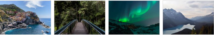
Kode di atas akan menghkasilkan gambar seperti di bawah ini :
Contoh Lain
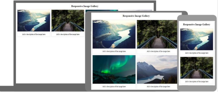
Galeri Gambar Responsif
Cara menggunakan kueri media CSS untuk membuat galeri gambar responsif yang akan terlihat bagus di desktop, tablet, dan smartphone, yang akan menghasilkan gambar seperti di bawah ini :
<!DOCTYPE html>
<html>
<head>
<style>
div.gallery {
  border: 1px solid #ccc;
}

div.gallery:hover {
  border: 1px solid #777;
}

div.gallery img {
  width: 100%;
  height: auto;
}

div.desc {
  padding: 15px;
  text-align: center;
}

* {
  box-sizing: border-box;
}

.responsive {
  padding: 0 6px;
  float: left;
  width: 24.99999%;
}

@media only screen and (max-width: 700px) {
  .responsive {
    width: 49.99999%;
    margin: 6px 0;
  }
}

@media only screen and (max-width: 500px) {
  .responsive {
    width: 100%;
  }
}

.clearfix:after {
  content: "";
  display: table;
  clear: both;
}
</style>
</head>
<body>

<h2>Responsive Image Gallery</h2>
<h4>Resize the browser window to see the effect.</h4>

<div class="responsive">
  <div class="gallery">
    <a target="_blank" href="img_5terre.jpg">
      <img src="img_5terre.jpg" alt="Cinque Terre" width="600" height="400">
    </a>

  </div>
</div>


<div class="responsive">
  <div class="gallery">
    <a target="_blank" href="img_forest.jpg">
      <img src="img_forest.jpg" alt="Forest" width="600" height="400">
    </a>

  </div>
</div>

<div class="responsive">
  <div class="gallery">
    <a target="_blank" href="img_lights.jpg">
      <img src="img_lights.jpg" alt="Northern Lights" width="600" height="400">
    </a>

  </div>
</div>

<div class="responsive">
  <div class="gallery">
    <a target="_blank" href="img_mountains.jpg">
      <img src="img_mountains.jpg" alt="Mountains" width="600" height="400">
    </a>

  </div>
</div>

<div class="clearfix"></div>

<div style="padding:6px;">

</div>

</body>
</html>